UI/UX, UX Research, Branding
Gold Coast Residence
Duration: Over 6 months
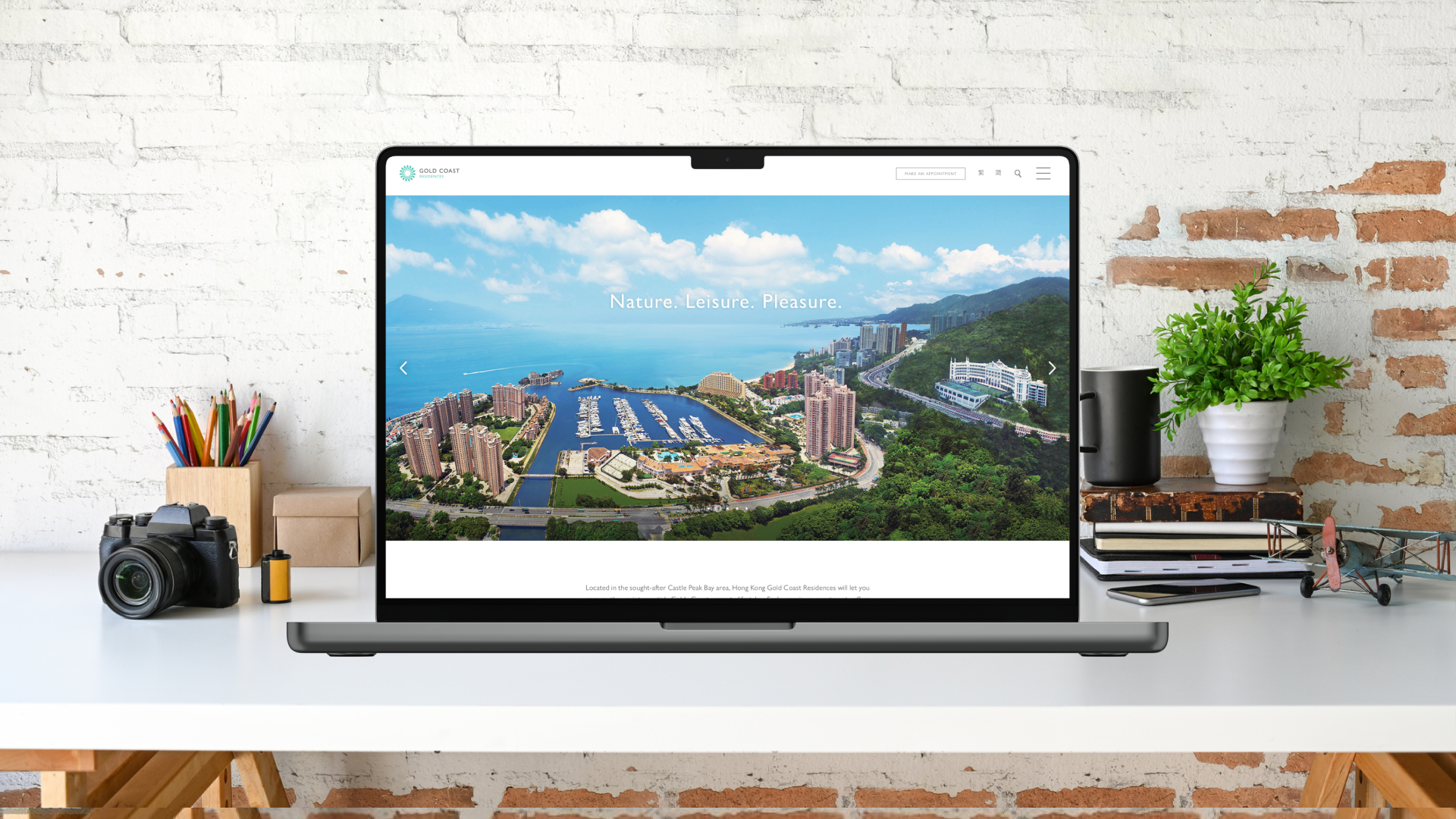
Online Location: Visit the Gold Coast Residence website
Our client sought to standardize and unify the design across their Gold Coast website offerings. This initiative aimed to strengthen brand consistency across all digital platforms while also improving the quality of user experience.
As part of the engagement, we conducted a comprehensive digital audit to evaluate both the visual design and usability of the existing digital touchpoints, identifying opportunities for enhancement.
The following section presents a selection of the UX artifacts and UI screens developed throughout the website revamp — from initial research through to final design deployment.
Discover and Define Phase
User Experience Research
During the Discover and Define phases, user experience research typically includes qualitative one-on-one interviews and the development of key UX deliverables such as personas, empathy maps, and journey maps.
The interviews are designed to understand users’ goals and requirements when visiting the website and renting a home. Key topics include the value of promotional offers, the criteria used to evaluate an “ideal” home, the role of community, and how effective high-resolution images or virtual tours are in shaping and managing expectations.
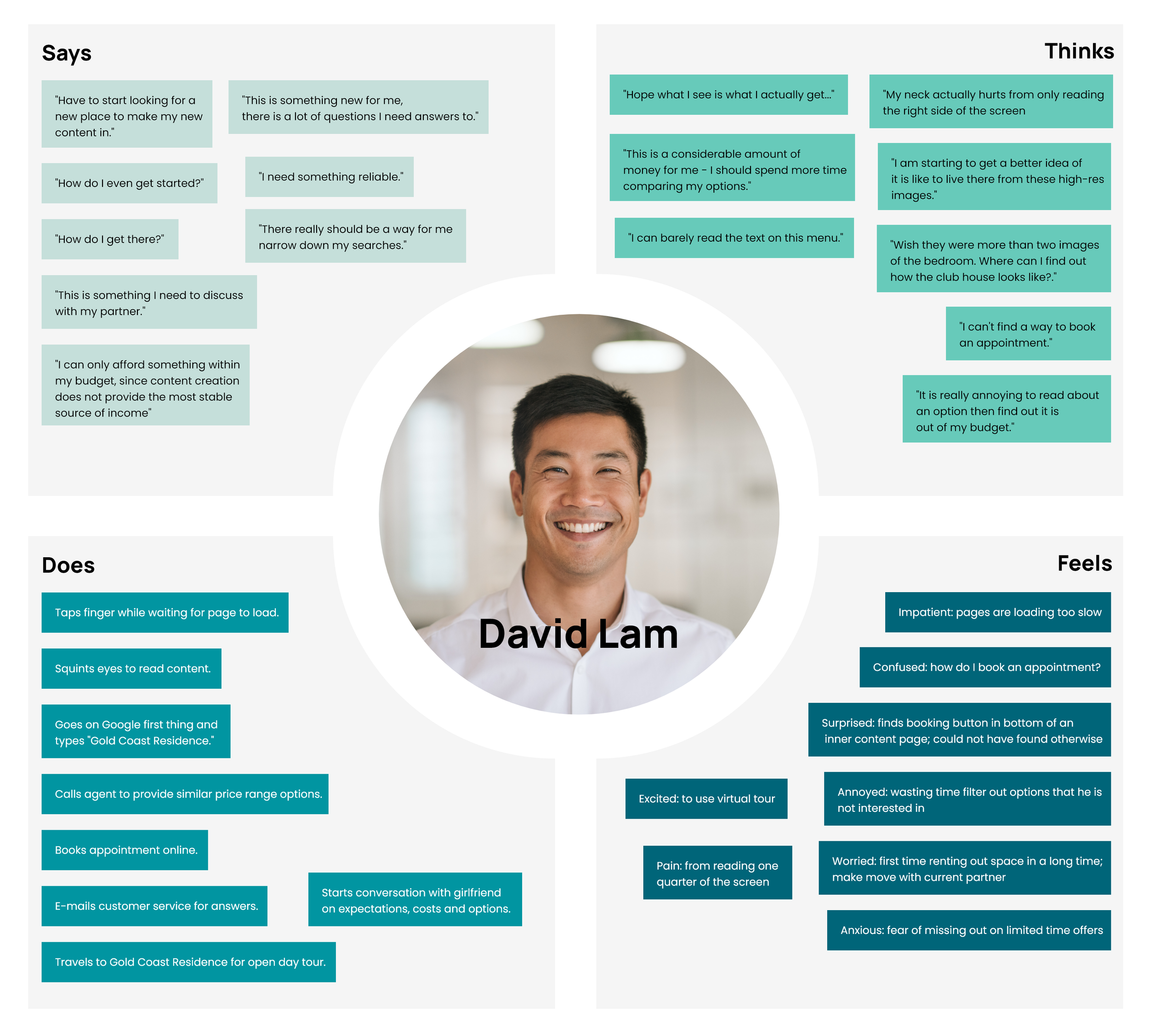
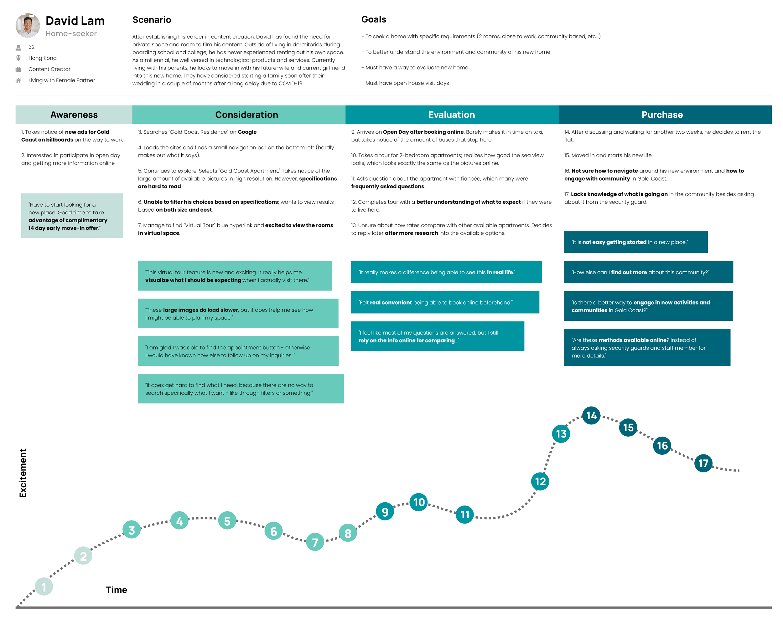
In addition, personas are created to capture common user scenarios, objectives, needs, motivations, frustrations, and demographic patterns. Empathy maps further document the thoughts, feelings, and challenges of home-seekers, while journey mapping captures both the current and desired renting experiences. The following examples highlight deliverables produced during this phase for the project.
Persona Development

Empathy Mapping
Journey Mapping (As-Is)
Opportunity Area - Pain Points and Challenges
Our research identified several usability challenges and user pain points with the current experience, including:
Navigation challenges: The navigation does not align clearly with user goals.
Opportunities in information architecture: Content organization and taxonomy could be optimized for easier discovery.
Reduced readability: Visual design elements impact readability and comprehension.
Slow performance: Page load speed is inconsistent and affects user patience and engagement.
Limited search and filtering: Users cannot easily search for or filter relevant content.
Insufficient conversion pathways: Clear calls-to-action (CTAs) for booking appointments are not consistently available.
Limited visual content: Users have access to fewer images, which makes it harder to evaluate properties.
Underutilized virtual tours: Virtual tour functionality is present but not used effectively within the experience.
Gaps in facility and room imagery: There are not enough images to help users assess key features such as facilities and individual rooms.
Minimal digital community engagement: There are limited opportunities for users to connect with the community through digital channels.
These findings informed the design priorities for the website revamp.
Problem Definition
These activities above enable the synthesis of pain points and the identification of key opportunity areas. From this insight, solutions are proposed and framed through “How Might We” (HMW) problem statements to guide the overall design direction.
Here is one example of how the problem was framed:
“How might we design a website for home finders to examine and evaluate whether Gold Coast Residence will provide their ideal living experience? ”
Develop and Deliver Phase
User Interface Components
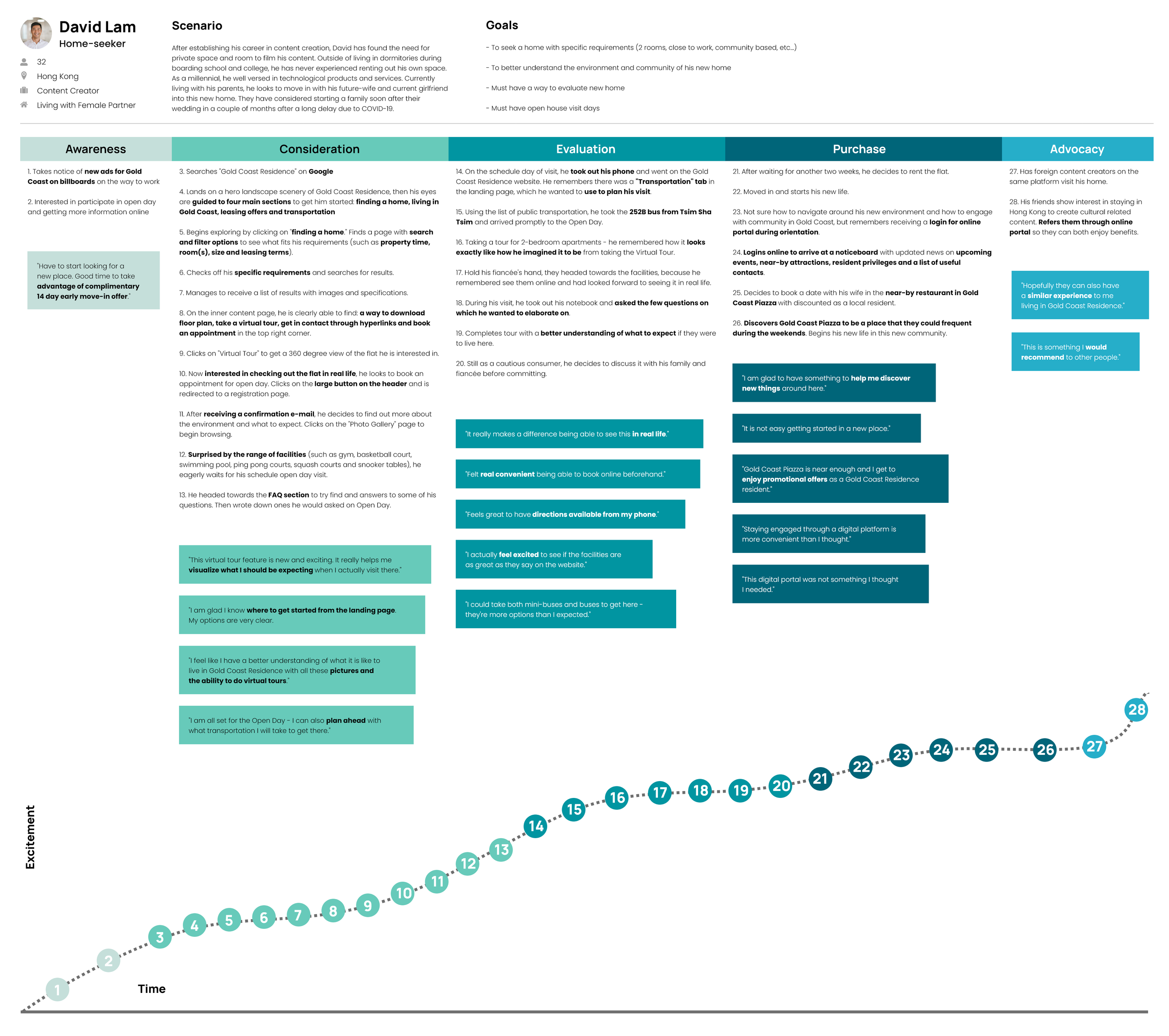
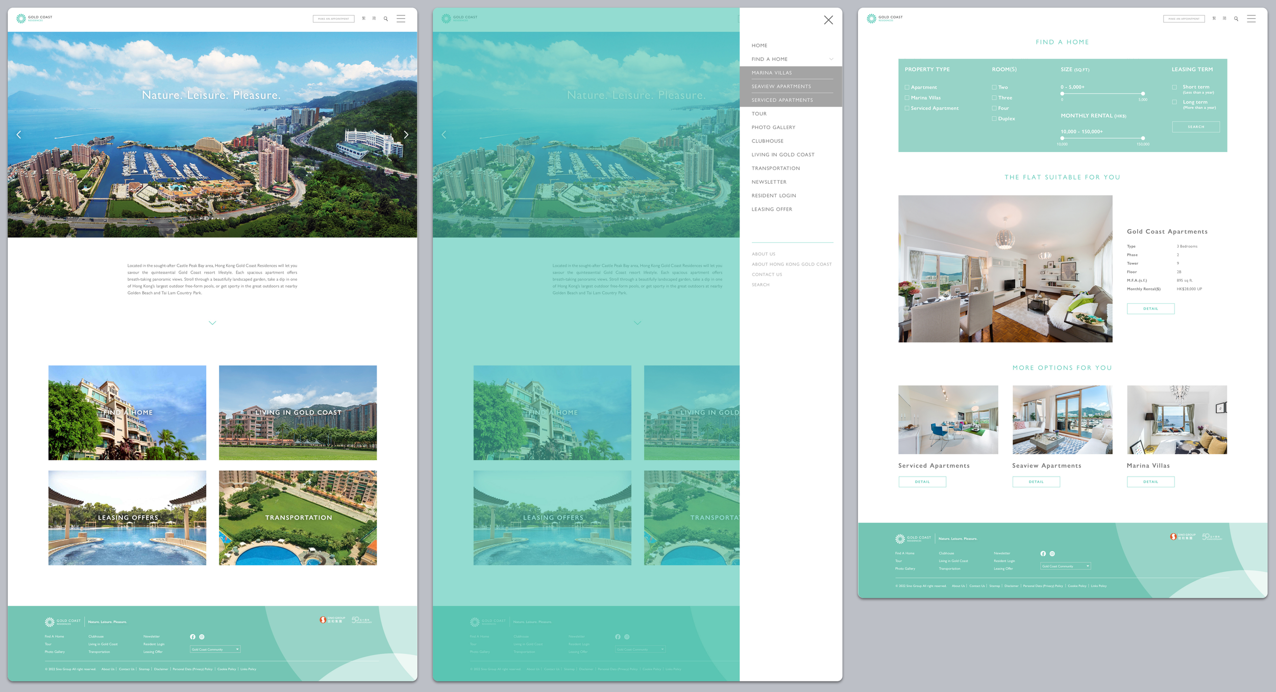
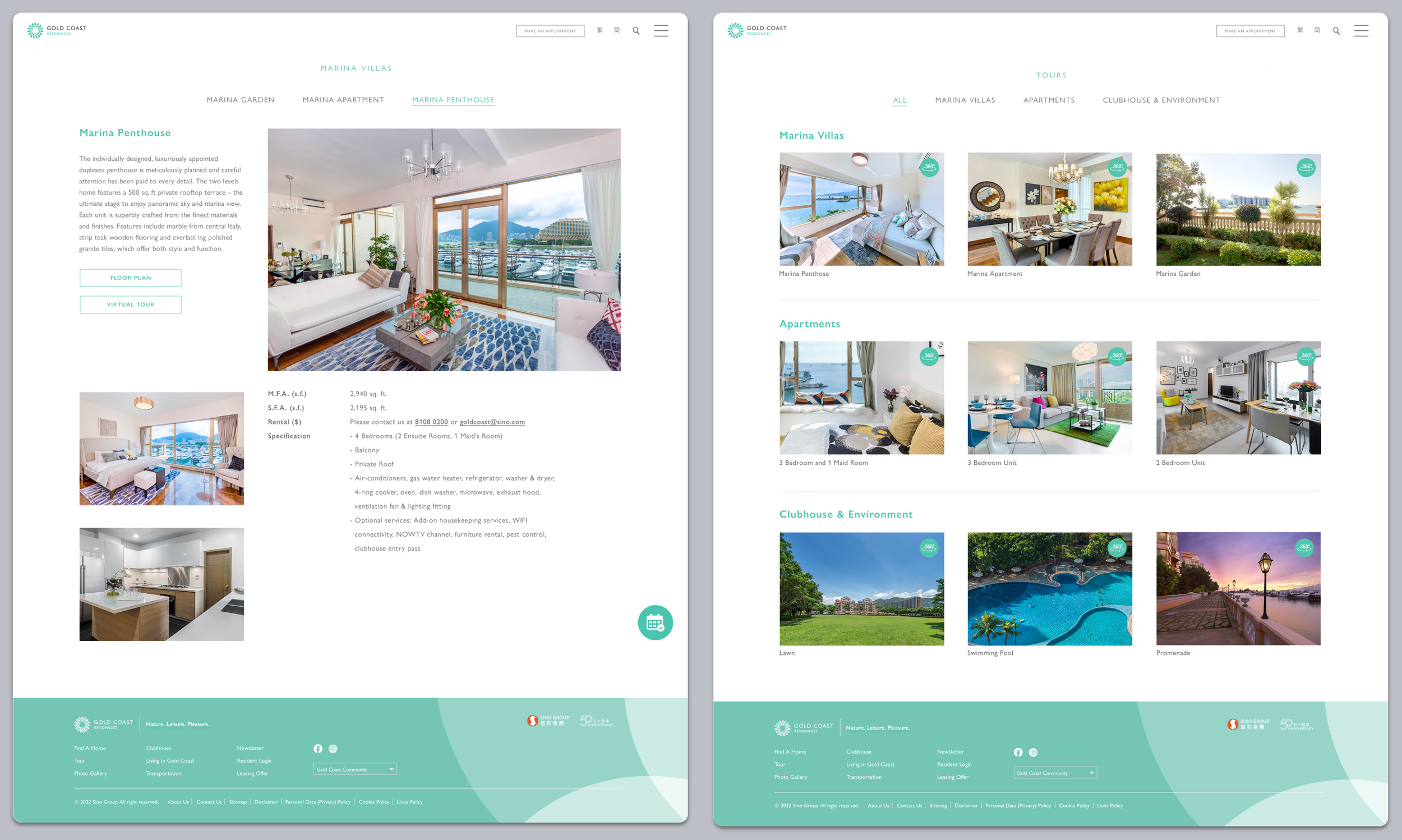
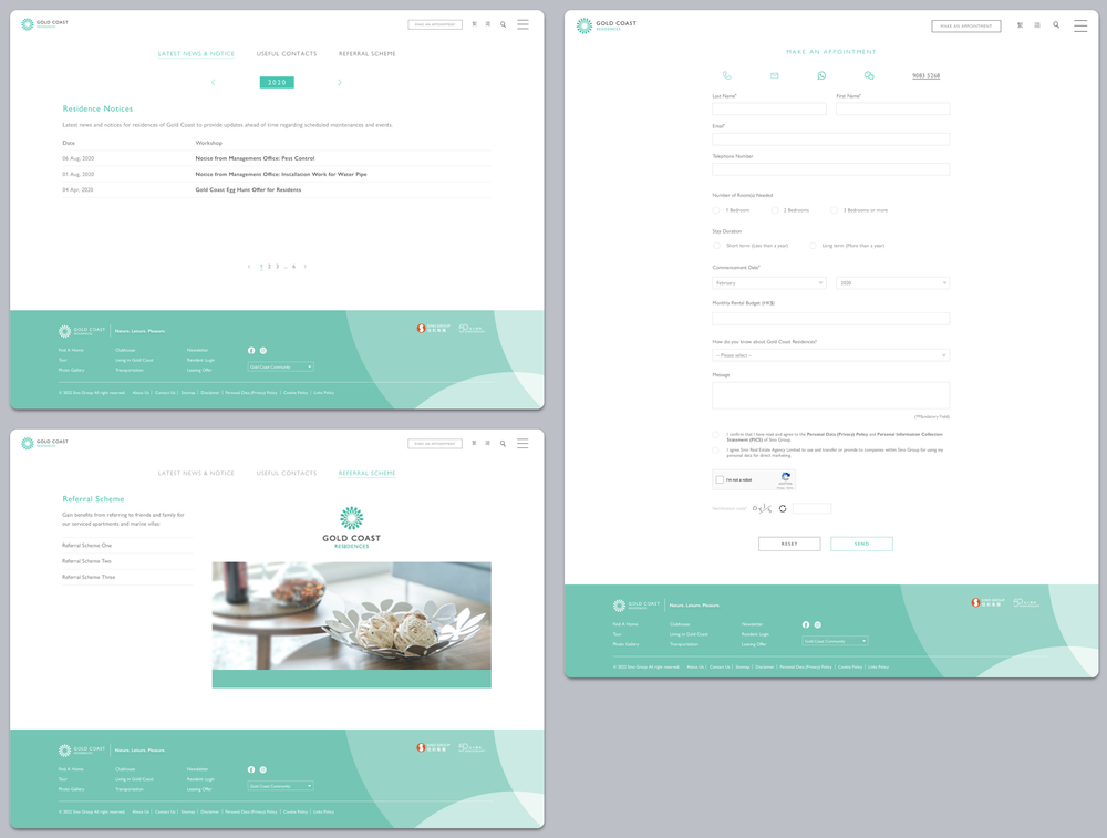
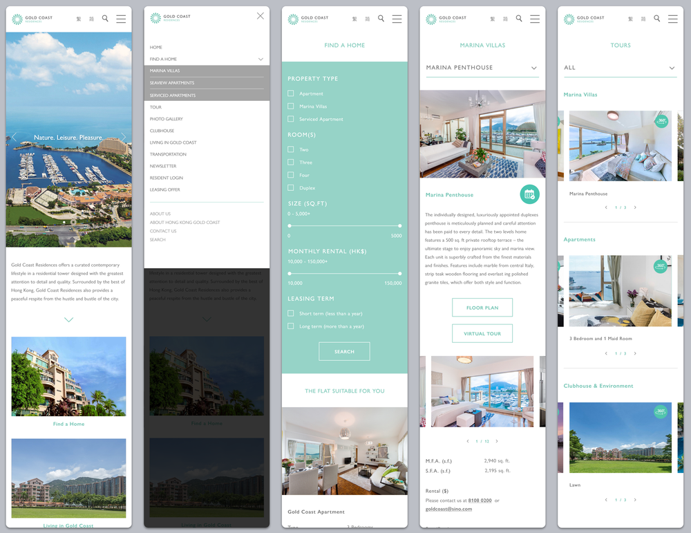
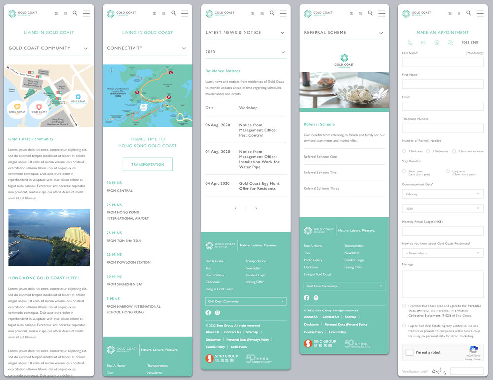
The following section presents selected to-be journey maps, wireframes, and design screens developed during the Define and Deliver phases. These visuals demonstrate the user experience across key touchpoints, highlighting core interactions and addressing previously identified pain points.
By reviewing and analyzing these elements, we can determine where improvements are needed and ensure the final design reflects user expectations and supports effective task completion.
Journey Mapping (To-Be)
Design System
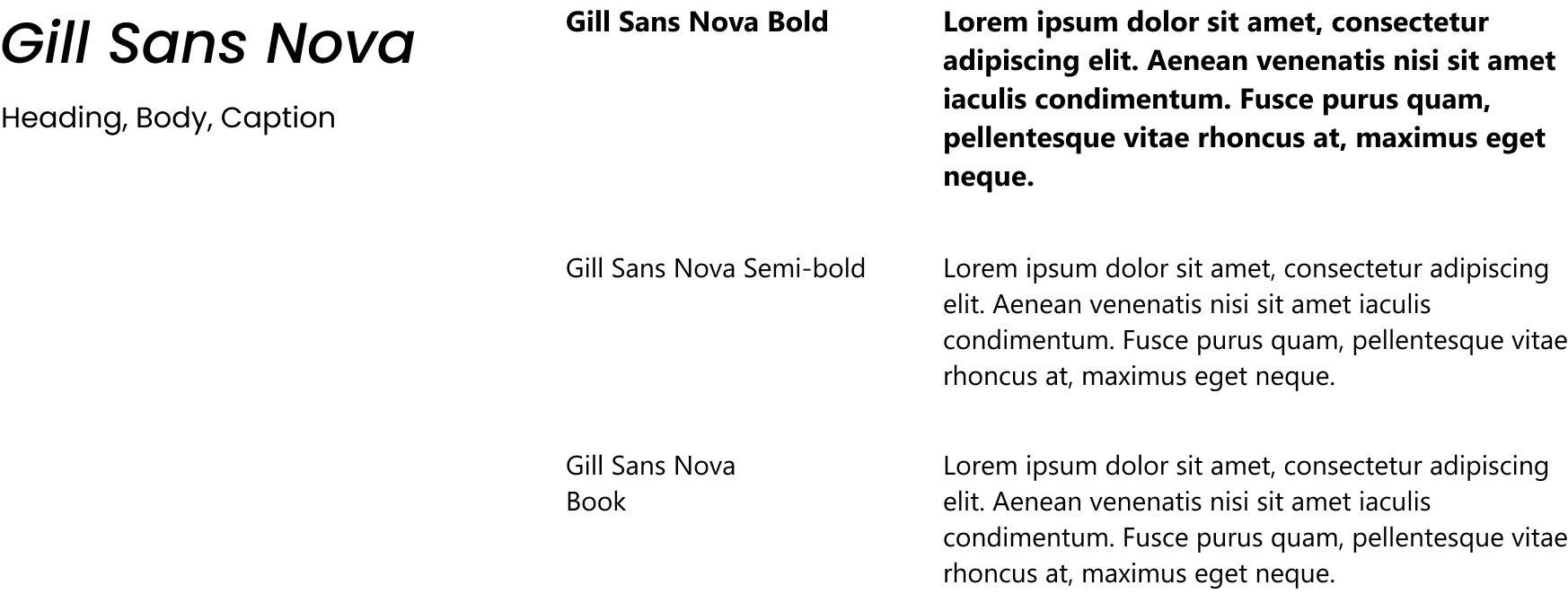
Typography
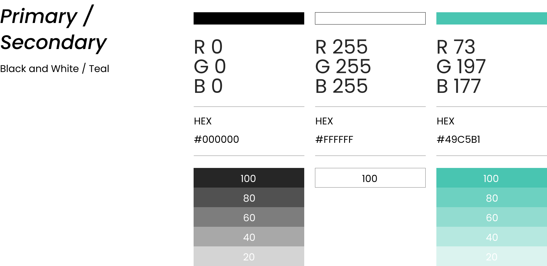
Color
Wireframe

Layout

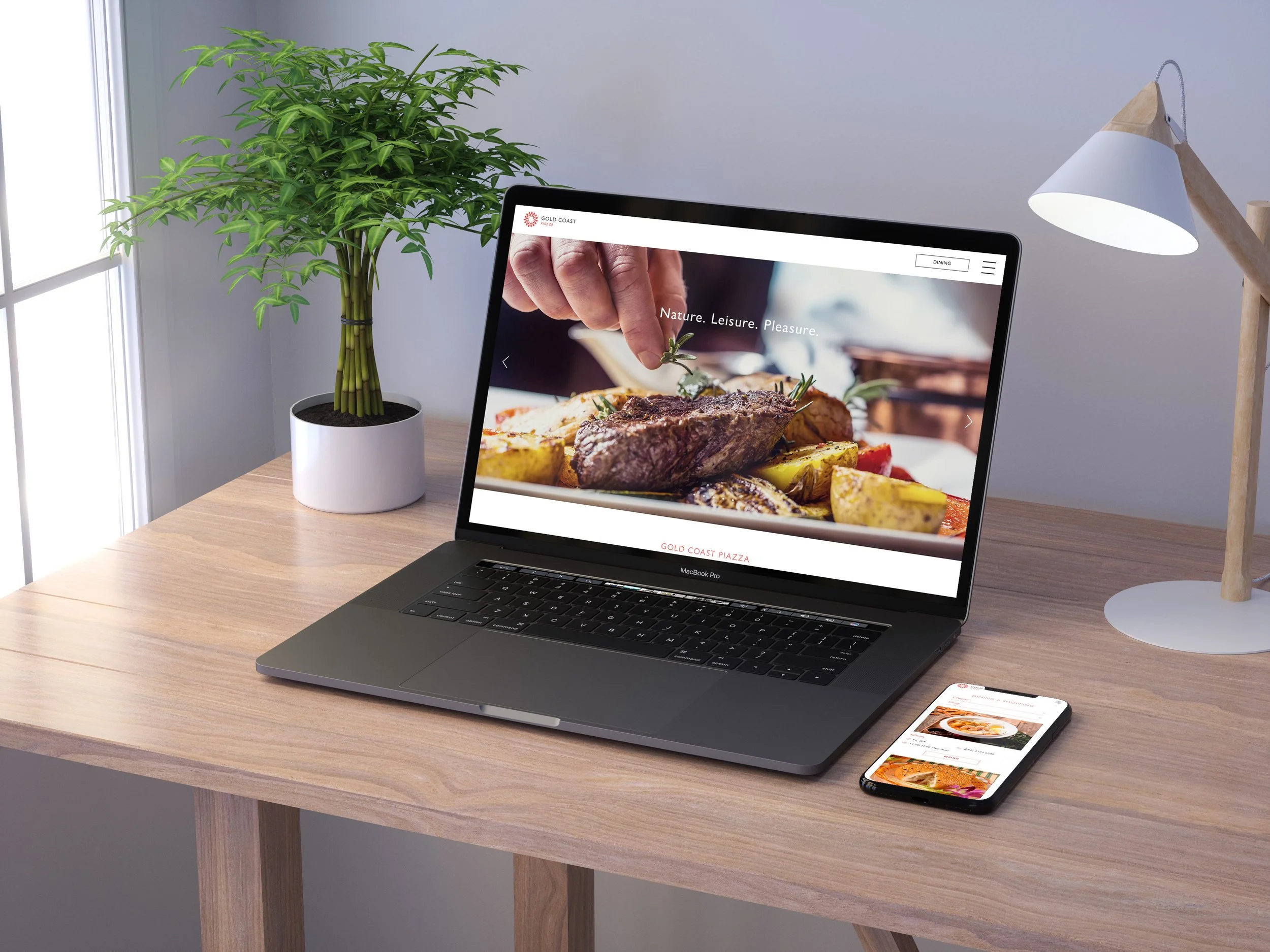
Other Works

Hennessy NBA

MTR Tap Tap Game
Gold Coast Piazza